My Most Beautiful Books • Karin from little words

As regular readers of this blog know, I love beautiful books. Holding an artfully and finely crafted book in my hands is a very special pleasure for me. I’m not alone in this passion, but the love for beautifully designed books isn’t all that common. I personally find it difficult to discover new, beautiful editions, and that’s why I’m starting a new series with this post: “My Most Beautiful Books.” Selected book bloggers and book lovers will present some of their most beautiful German-language books here and offer a glimpse into their personal treasures and most magnificent collector’s editions.
I’m very happy that I was able to win Karin for the first post. On her book blog little words (book-up-your-life.blogspot.com), she regularly presents gorgeous books and stages them beautifully in her photographs. I love browsing through her blog and have discovered one or two wonderful and at the same time beautiful books there (for example this one). I immediately associate Karin’s blog with beautiful books, and just by the way she presents them, you can tell how much she loves aesthetically appealing editions. You’ll find many high-quality classics on her site—books that are not only lovely to look at but also of the finest literary quality. For me, it was clear that a series about beautiful books could only begin with Karin. But now I’ll hand over the word to her, and I hope you enjoy following her on a stroll through her bookshelf as much as I did.
When I look at my book collection, I must admit that I have a weakness for beautiful editions. The so-called collector’s editions often shine through gold embossing, exquisite illustrations, a decorative ribbon marker, or other details that especially appeal to the eye. Tobi asked specifically about these kinds of books, and I happily looked through my shelves to see what I could find. So here are a few tips for beautiful German-language collector’s editions.
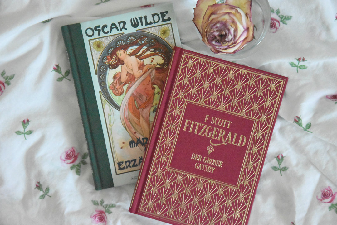
Beautiful (classic) collector’s editions for a small budget can be found, for example, at Nikol Verlag. “Oscar Wilde: Fairy Tales and Stories” is one I especially like for its outer illustration, half-cloth binding, and silver lettering on the spine. Inside, there are lovely Art Nouveau-style illustrations that make the little book a visual highlight. Unfortunately, this edition is now out of print, but the publisher will release a new boxed set in September that includes all of Oscar Wilde’s texts. Also worth noting is the new “Linen Deluxe” series from the same publisher. Many interesting titles were released there last month. I immediately went for “The Great Gatsby” by F. Scott Fitzgerald in wine red! But the series also includes E.T.A. Hoffmann’s “The Sandman” and Stefan Zweig’s “Chess Story.”
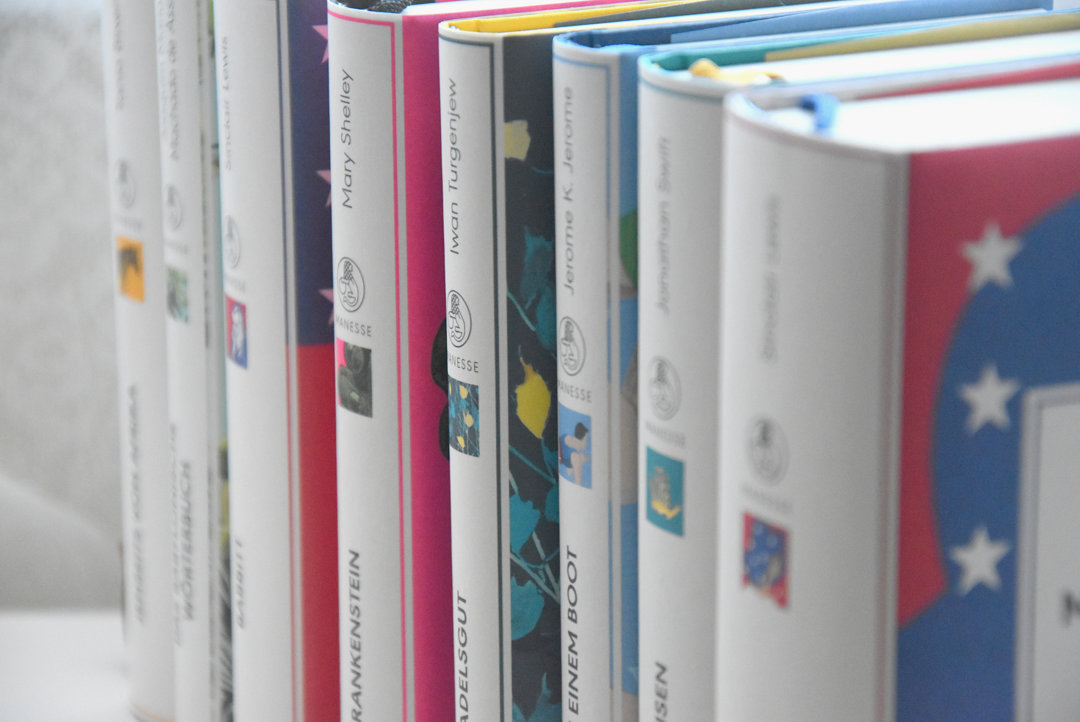
You can also always find beautiful, compact classics at Manesse Verlag. I’m particularly fond of the new “Manesse Library”. The colors are more vibrant, the ribbon markers match the covers, and the endpapers feature designs that relate to the text. Although it’s hard to choose a favorite, I can highly recommend “Frankenstein” and the novels of Sinclair Lewis. I’m sure there’s something for everyone. Another gem from Manesse Verlag, though not part of the usual library series, is definitely “Wine and Hashish” by Charles Baudelaire. The cover, with its velvety wine-red texture and additional gold embossing, is stunning. The essays collected inside are, of course, brilliant as well—some more enjoyable than others—but all worth reading.
Charming gift books with inspiring quotes from famous writers and philosophers can be found in the “Quite Beautiful…” series from ArsEdition. The interior design invites you to dream, linger, and flip back and forth constantly. Perfect for gifting! There are currently six editions featuring: Oscar Wilde, Ringelnatz, Jane Austen, Goethe, Confucius, and Christian Morgenstern.
Similarly designed are the Herder Verlag “Wisdom” series featuring famous figures. I was again drawn to the Oscar Wilde volume (sadly also out of print, though secondhand copies can be found), while the Ringelnatz edition is still available. The bright color immediately catches the eye, and the gold shining through beneath the dust jacket is delightful to see.
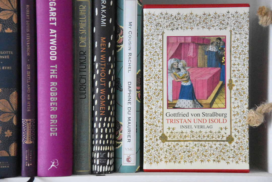
If you want to go further back in literary history, I recommend the linen edition of “Tristan and Isolde” from Insel Verlag. Consisting of two volumes—one with the story itself and the other with commentary—you can spend quite some time delving into Middle High German (don’t worry, a modern German translation is also included) and its literary context. I must admit I would never have picked up this book without my studies. But if you take the time to read the commentary and explore the motifs and period, you’ll surely find it rewarding. And with such a beautiful edition, it’s even more enjoyable.
Two newly added editions on my shelves are “Pan’s Labyrinth” by Cornelia Funke and Guillermo del Toro and “The Most Boring Book in the World.” The first is the novel version of the famous film classic and a real eye-catcher. Whether you’re starting to read, removing the dust jacket, or deep into the story, there are illustrations everywhere that make the book special (and I haven’t even started reading yet). The second book was published in early September by Atlantik Verlag and—contrary to its title—is anything but boring in terms of design. There may not be gold embossing, but there are many puzzles, comparison images, and even little sheep along the page margins. What always wins me over is an interesting spine design—and this one looks great on the shelf once you’re done reading.
Of course, I also have to mention the Büchergilde editions. Not every cover appeals to me, but there are still some truly special ones. For example, “Heart of a Dog” by Mikhail Bulgakov. The story itself is remarkable, but the Büchergilde’s design elevates it even more. There are countless illustrations and small details throughout the book. As a little highlight, it even includes an “interactive element” (similar to the MinaLima editions, which are now also available in German).
A novel that doesn’t feature particularly elaborate illustrations or “specials” but still impresses through beautiful design is “One Hundred Years of Solitude” by Gabriel García Márquez. I especially love this edition because the cover and spine are stunning, and the endpapers are also delightful. Sometimes it’s the small details that make a book a treasure.
Two editions of Stefan Zweig are also among my favorites. The particularly elaborate edition from Topalian & Milani Verlag contains two stories: “Buchmendel” and “The Invisible Collection”. These were the first Zweig texts I ever read, and I was immediately fascinated by his powerful language. All the more delightful that the book is adorned with numerous illustrations that make reading a special experience. They lean slightly toward the darker side, but for fans of the author’s stories, this book is a must. The second collector’s edition comes from S. Fischer Verlag, titled “Decisive Moments in History”, one of Zweig’s most famous works. It also features gorgeous illustrations, perhaps a bit more “dreamlike” than in the previous one.
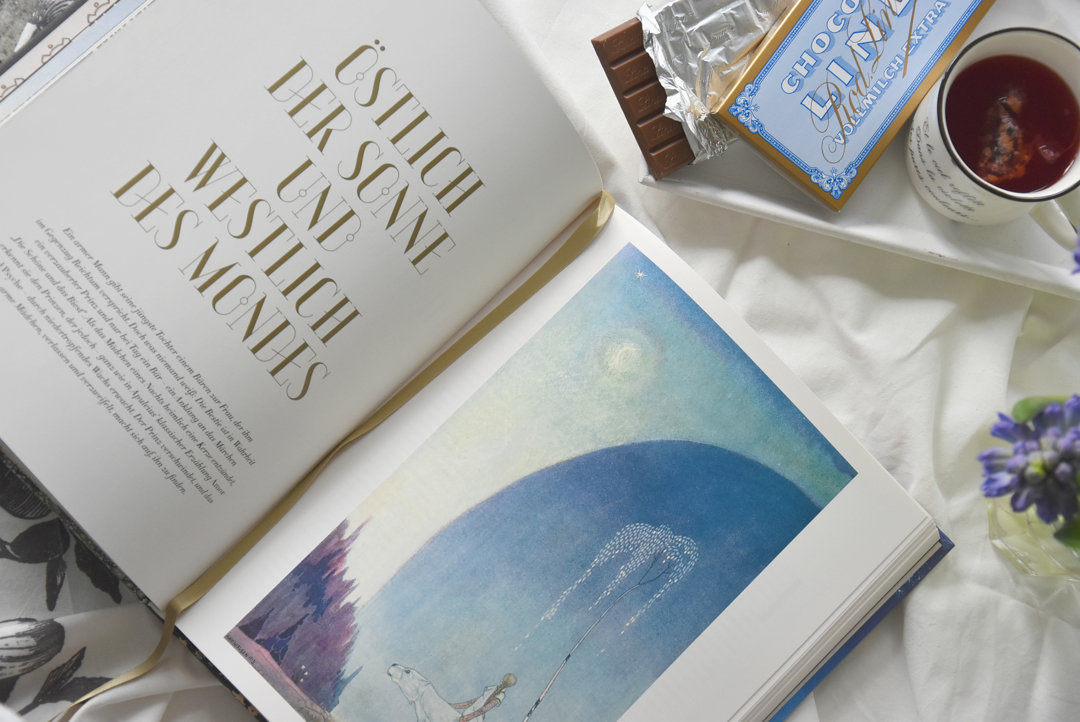
Three collector’s editions that focus even more on visual design are “The Fox and the Star” by Coralie Bickford-Smith, “The Little Prince” by Antoine de Saint-Exupéry, and “East of the Sun and West of the Moon” illustrated by Kay Nielsen. These are perfect for anyone who loves fairy tales and enjoys letting their thoughts wander, as the illustrations so strongly complement the text that you truly lose yourself in the stories. Especially in Kay Nielsen’s works, you can feel the cold of the landscapes and the yearning of the characters, which bring the Scandinavian tales to life in a new light.

Another beautiful edition that takes a slightly different approach than the ones mentioned so far is “If I Could Tell You Just One Thing…” by Richard Reed. Here, well-known and inspiring people share advice for life—without being preachy! What motivated them? What have they learned? Alongside these wonderful quotes, each person is accompanied by an illustration. The book’s page edges are a vivid orange, giving it a distinctive look.
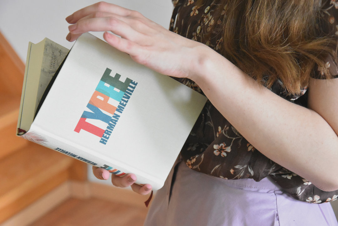
When talking about collector’s editions, one cannot overlook the books from Mare Verlag. They especially appeal to readers who enjoy stories about or set at sea. Personally, I’m very fond of the new edition of “Typee” by Herman Melville! When placed side by side on a shelf, these books look like a little rainbow—which of course adds to their charm. The editions are bound in linen and usually come in matching slipcases. Very appealing and of high quality—perfect as gifts for bibliophiles.
Finally, I want to mention “S. – Ship of Theseus” by J. J. Abrams and Doug Dorst and the “Classics Reimagined” series from Coppenrath Verlag. Abrams and Dorst’s novel-within-a-novel is one of my absolute favorites among collector’s editions. It looks like an old library book filled with inserts—newspaper clippings, postcards, letters, etc. Many readers find the story itself challenging, but I loved the concept and execution. It reminded me a bit of Marisha Pessl’s “Night Film” and plays wonderfully with mystery. (The German edition was published by Kiepenheuer & Witsch in a limited run, but the English edition is still available.)
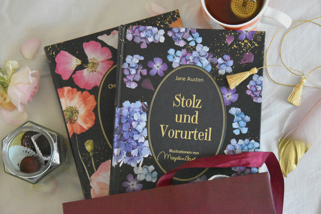
In a similar style—with ten removable inserts (character sheets, family trees, postcards, etc.) but with a more floral pattern—come the Coppenrath editions, which already include several novels by Jane Austen and “Jane Eyre” by Charlotte Brontë (with more planned). I think they’re wonderful because they help bring classic texts closer to younger readers and refresh their somewhat dusty image.

I hope you enjoyed the first post of this series and found plenty of inspiration for beautiful books. If you’d like more, I recommend visiting Karin’s blog little words.
What are the most beautiful treasures on your bookshelf? Do you already own any of the books mentioned here? Should this series continue? Who else should share their most beautiful books here?
Die Coppenrath-Reihe besitze ich auch, und hier möchte ich die MinaLima Reihe aus dem Coppenrath Verlag noch empfehlen (Das Dschungelbuch, Der geheime Garten, Peter Pan, Die kleine Meerjungfrau und Die Schöne und das Biest ). Ebenfalls wunderschöne Bücher findet man bei Jacoby & Stuart, Bohem und dem Kindermann Verlag
Das stimmt, die MinaLima-Reihe muss eigentlich auch genannt werden. Habe die Bücher nur auf englisch, daher habe ich sie lieber rausgelassen. :)
Jacoby & Stuart hat die schöne “Alice im Wunderland” & “Der Zauberer von Oz” Ausgabe veröffentlicht, oder? Die sehen wirklich traumhaft aus. Müsste ich vielleicht mal auf die Weihnachtswunschliste setzen.
Der Bohem und Kindermann Verlag hat mir jetzt tatsächlich nicht so viel gesagt. Danke für den Tipp, da gehe ich direkt mal Stöbern!
Liebe Grüße
Karin
Ja, “Alice im Wunderland” ist bei Jacoby & Stuart erschienen, und ein ganz besonderes Buch aus diesem Verlag ist “Madame Butterfly” – grandios.
Bei Bohem sind die “Dschungelbücher” erschienen und die Geschichte von “Flocke” und “Tropfen”. Ebenso gibt es zwei wunderschöne Bücher vom Prestel Verlag: “Unter meinen Füßen” und “Der weite Himmel über mir”. Und Prestel hat Künstler-Bücher für Kinder herausgebracht.
Ein ganz besonderes Kunst-Werk ist “1001 Nights” von Kay Nielsen illustriert. Sicherlich – es hat seinen ( zugegeben nicht gerade geringen ) Preis, allerdings befinden sich in der Schmuck- Kassette zusätzlich zum Buch 21 Druckgraphiken.
Moin,
tatsächlich habe ich auch noch ein paar reale Bücher :) Drunter die Werke von Shakespeare, aber auch Schiler, Poe und Heine. Und noch eine Handvoll, die nicht äusserlich hübsch sind, aber inhaltlich. Und natütlich meine ganz besondere Ausgabe des Herr der Ringe von Anna.
Und man mag es nicht glauben, es gibt ach “Prunkausgaben” unter eBooks :) Tatsächlich schafft es kein Buch auf meinen Reader ohne nicht durch meine pimp-up Mühle gelaufen zu sein. Da gibt es Cover die verzerrt dargestellt werden, dazu noch in grottiger Auflösung- Daneben gibt es aber die Cover im Pressebereich der Verlag in hoher Auflösung und guter Qualität für umme zum Herunterladen. Wie man Metadaten korrekt aufsetzt scheinen auch die wenigsten Verlage zu wissen, ind die IDPF Norm für epub2 ist für viele ein Buch mit sieben Siegeln. Vermutlich um Lizenzkosten zu sparen werden dann nicht dir Fonts aus dem Buch hergenomen, sondern die ausgelutschten frei verfügbaren LinLibertine und DejaVu. Die werden dann gleich in voller Pracht mit allen Glyphen und Schnitten, damit das Buch auch ja schön fett aussieht beim Download.
So pimpe ich erstmal jedes Buch auf, bevor ich es mir zu Gemte führe, und ich denke dass meine Versionenen viele von den Verlagseditionen in den Schatten stellen. Nichtsdestotrotz liebe ich meinen Reader, ein wesentliches Merkmal ist das jedes Buch nur 200 gr wiegt, egal ob es sich um Shakespears gesammelte Werke, eine Schwarte von Tad Williams oder ein Büchlein von Tania Blixen. Es lümmelt sich einfach besser, auch im Urlaub :)
Mit der Erwähnung von Karins Blog hast du dir jetzt aber selbst ins Knie geschossen, Tobi. Denn bisher habe ich nur zwei Blogs aktiv verfolgt, eines über Bücher und eines übers Kochen. Nun könnte ein dritter Blog Einzug in die Bookmarks finden. Und ich hab auch schon zwei Bücher aus ihrem Blog auf meine Merkliste gesetzt.
Das ist aber auch einer der größten Nachteile: Man verliert die Übersicht über seinen SuB.
Das Schiff des Theseus wäre noch ein Buch für mich, das ist als elektronische Varinate wohl nur als PDF umzusetzen und das hat keine Hand und keinen Fuss. Leider ist das Buch nur noch zu absurden Preisen erhätlich.
//Huebi
Lieber Huebi,
das kann ich gut verstehen, dass du die ebooks nochmal ordentlich nachbearbeitest. Für eine ordentliche Sammlung und Lesegenuss, muss das schon stimmen. Problem ist ja immer eher die Zeit und wenn man sich die nimmt um ein gutes Buch zu lesen, dann soll da auch alles stimmen. Da bist du ja schon ziemlich ein Profi, wenn du das alles selbst aufbereitest.
Na Karins Blog ist auch top, also ist das völlig ok, wenn du ihren Blog auch noch liest. So lange du ab und zu noch bei mir vorbei schaust ;)
Herzliche Grüße
Tobi
Naja, als IT’ler habe ich da diverse Templates und Pythonscripte, die mir die Arbeit da vereinfachen :)
//Huebi
Wie schön! Eine wunderbare Idee für eine Serie, an schönen Büchern kann ich mich – wie viele andere Bücherliebhaber*innen – ja nicht sattsehen.
Danke für die Einblicke, ich freue mich auf weitere Beiträge!
Liebe Grüße
Petra
Liebe Petra,
vielen Dank für Dein Feedback. Also mit der Serie geht es ganz sicher weiter, allerdings in zeitlich etwas größeren Abständen. Ich bin mir sicher, dass es da noch einige Prachtstücke gibt, die der ein oder andere im Schrank hat. Ich finde ja Karins Auswahl top und hab da das ein oder andere Buch noch gefunden, obwohl ich da schon ziemlich gut informiert bin :)
Herzliche Grüße
Tobi
Wenn ich mir die schönen Bücher bei Dir ansehe und Deine Bemerkungen dazu, möchte ich nur eins: kaufen, kaufen, kaufen – egal was innerhalb der Einbände steht.
Hallo,
ach, das sind wirklich Schmuckstücke! Die Manesse-Bibliothek würde ich gerne komplett im Regal stehen haben – aber da ist kein Platz mehr!
Die meisten Schmuckausgaben, die ich besitze (und das sind leider nicht viele) sind englische Ausgaben, wie zum Beispiel Shakespeare oder Sherlock Holmes. Im Moment liebäugele ich ja mit der neuen Büchergilde-Abobox. [ Kurze Werbepause ] Ach, was soll’s, sich hab sie gerade abonniert.
“Typee” werde ich mir mit Sicherheit noch anschaffen, allerdings ist mein Buch-Budget für diesen Monat mit der Büchergilde-Abobox schon ausgereizt. ;-)
LG,
Mikka
Liebe Mikka,
ui die Büchergilde-Abobox kannte ich noch gar nicht. Allerdings gefallen mir nur wenige Bücher der Büchergilde, also so eine Box würde sich für mich nicht lohnen. Seit ein paar Monaten bin ich aber auch bei der Büchergilde und die haben schon ein paar echt hübsche Ausgaben. Darüber werde ich auf jeden Fall noch bloggen.
Die Manesse Bücher finde ich auch sehr schick, mir gefallen aber auch da nicht alle Bücher. Also zum Sammeln wäre das nichts. Platz im Regal hab ich auch nicht mehr viel, also das Problem kenn ich ;)
Bei Typee kannst du mit gutem Gewissen zugreifen, das Buch ist echt top. Low budget ist das Buch auf jeden Fall nicht, hat aber eine top Qualität und Verarbeitung. Aus meiner Sicht um ein Vielfaches besser wie die Bücher der Büchergilde. Es lohnt sich also, das Budget da ein bisschen auszureizen . Schöne Bücher ziehen mir auch immer ganz schön die Kohle aus der Tasche. ;)
Herzliche Grüße
Tobi
also – für schöne Bücher gebe ich schon eine Menge Geld aus. Gerade bei den Kinderbüchern gibt es auch wunderschöne Ausgaben. Ich habe mir gerade “Die unendliche Geschichte” ( neue Ausgabe von Thienemann ) zugelegt. Oder Tolkien – auch da gibt es richtige Kunstwerke.
Einen e-Book-Reader besitze ich zwar, benutze ihn aber so gut wie nie. Ich habe einige Monumental-Werke aus dem Ullmann Verlag. Dazu ein Lesepult. Das musste ich mir einfach zulegen.
Liebe Cläre,
von der Coppenrath-Reihe habe ich auch einige Ausgaben. Die sind sehr hübsch, das stimmt und die sind auf jeden Fall ein Tipp. Die Bücher von Lacombe im Jacoby & Stuart kenne ich auch. Der Bohem und dem Kindermann Verlag sagt mir auch nichts, da muss ich auch mal stöbern. Wobei bei Kinderbücher muss das auch immer passen und man sozusagen das passende Publikum auch bei der Hand haben ;) Meine absoluten Favoriten sind hier ja die Bücher von Benji Davies und Aaron Becker, die hab ich hier auch schon rezensiert, weil die Bücher einfach so hübsch sind.
Von Tolkien gibt es echt viele richtig schöne Ausgaben. Ich ärger mich aber auch immer ein bisschen, denn von Herr der Ringe kommt gefühlt jedes Jahr eine Prachtausgabe heraus und sonst siehts im Fantasybereich ja nicht so bombig aus. Das scheint sich nur bei den richtig bekannten Werken zu lohnen.
Wir haben auch einen E-Book Reader und ich hab mal ein paar Bücher damit gelesen. Aber so wirklich konnte mich das nicht überzeugen. Da sind richtige Bücher einfach ein viel zu großer Genuss.
Du hast einen Lesepult? Was ist das denn für ein Teil? Ich hab sowas mal gesehen, was man am Regal einhängen kann. Das sieht natürlich schon cool aus, wenn man da ein aufgeschlagenes Buch hat, aber auch wieder irgendwie schon verrückt.
Liebe Grüße
Tobi
Hallo Tobi,
hier ist der Link zu meinen Bibliothek-Fotos. Das sind aber längst nicht alle Bücher. Regale sind im ganzen Haus verteilt. Ich habe mir extra eine Software zum Katalogisieren zugelegt. Das Erfassen ist aber dennoch mühsam und geht nur langsam voran.
https://www.facebook.com/clare.jung.1/media_set?set=a.10204780336814652&type=3 .
Normalerweise sind die Fotos nicht öffentlich, aber hier kannst Du auch das Lesepult entdecken.
Liebe Grüße
Cläre
Klasse Idee für eine neue Reihe. Bin sehr gespannt auf weitere Beiträge!