My unique piece of "The Lord of the Rings"
In my last review, I already wrote about how I’ve returned to Tolkien’s books after a long time. I started with The Hobbit, and of course, The Lord of the Rings had to follow. Since I’ve been spoiled lately when it comes to beautifully designed books, the question arose: which edition should I get? The plain, green, paperback edition sitting on our shelf certainly wasn’t tempting. And since The Lord of the Rings is not exactly a short read and takes several weeks to get through, the overall presentation had to be right — it should also be a pleasure to hold and to look at. However, finding a truly luxurious edition isn’t that easy. So I decided on a unique copy. Where did I get it? That’s a real insider tip.
Since the demand for Tolkien’s books remains unbroken and has been reignited by the famous film adaptations, you can’t really find any bargains here. An old, beautifully bound edition can’t be had, as with so many other books, for just a few euros — they are still traded at high prices. The publisher Klett-Cotta offers several deluxe editions. One current version comes in multiple separate volumes, which I find rather bothersome, since there are also editions that combine all three volumes into a single book. Another edition, bound in leather, is available in a special limited edition of only 1,111 copies — truly opulent and beautiful. But you’ll have to shell out around 900 euros for it, which was a bit too much for me. Another disadvantage of these deluxe editions, aside from the exorbitant price, is the translator Wolfgang Krege. He’s often criticized for his “modernized” language, and for such a masterpiece I didn’t want to take any risks. So I decided to go for the highly praised translation by Margaret Carroux (even though I didn’t find Krege’s translation of The Hobbit bad at all).
So I browsed the web and came across Anna. Anna masters the art of hand bookbinding and specializes in unique creations. On her website and also on eBay, she offers wonderfully bound deluxe editions — some richly decorated, bound in fine leather, with gold-embossed titles, color-coordinated bookmarks, and often with beautiful slipcases. Among them is The Lord of the Rings, often in older printings, newly bound and creatively redesigned. Browsing the gallery and the archive on her website is a real pleasure. There are some truly stunning luxury editions that immediately set my heart racing. After visiting the website several times, I knew I was in the right place.
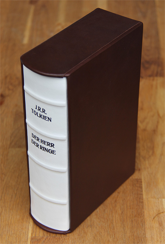
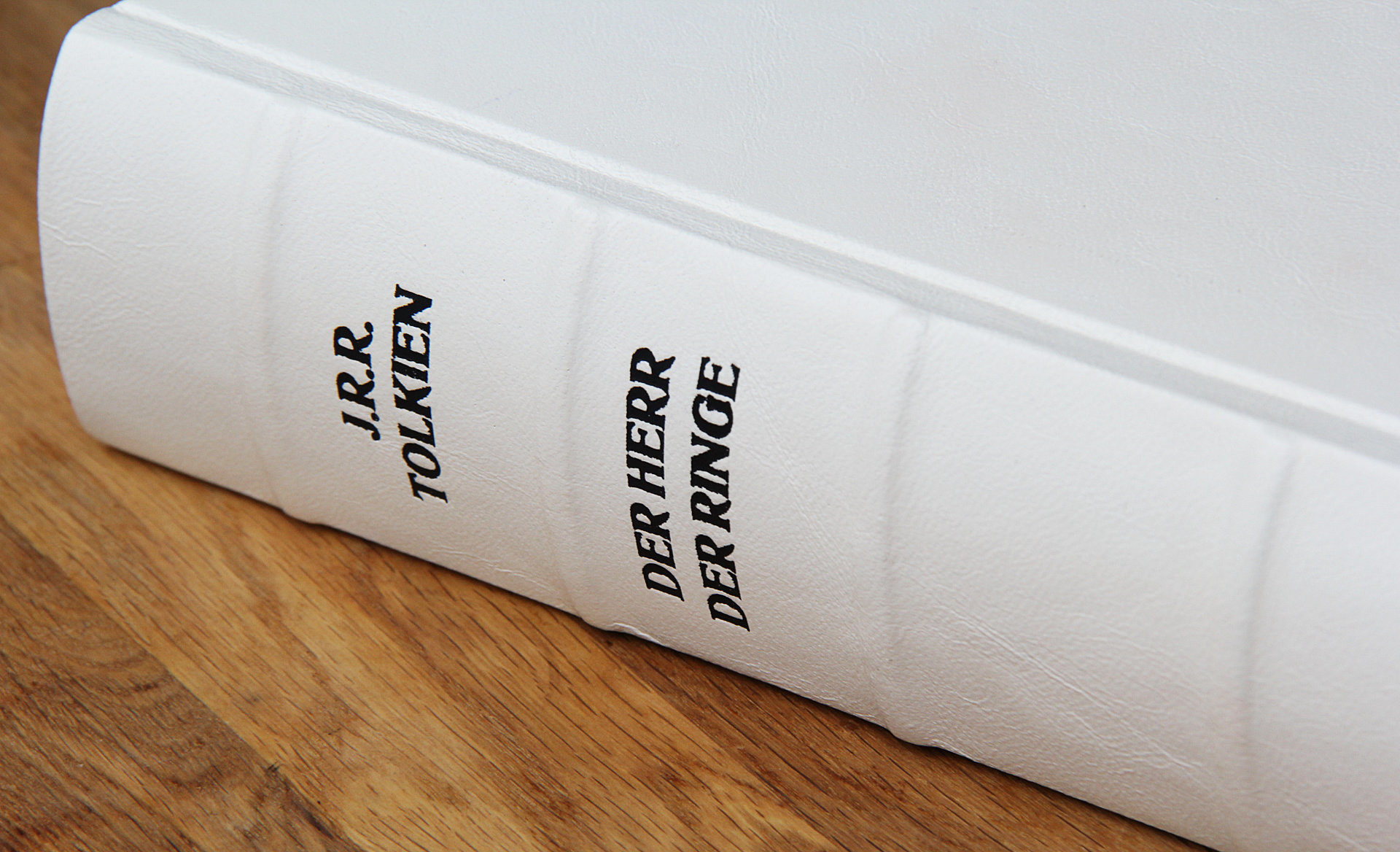
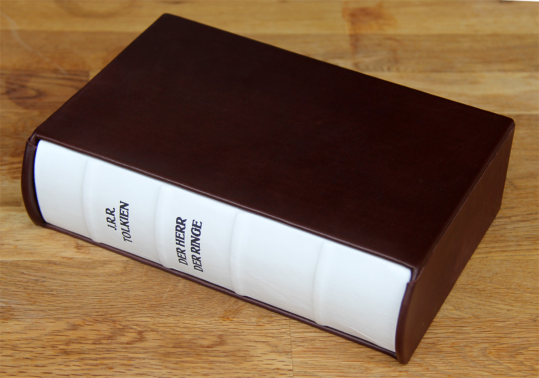
Based on the Klett-Cotta deluxe edition, which I already quite liked, I had a rough idea of how I wanted my book to look. White as the cover color, slightly pronounced bands, and smooth leather were a must. The placement of the embossed lettering on the spine of the Klett-Cotta edition seemed nearly perfect to me. The book itself should remain elegant and simple so that the form, color, and fine leather could take center stage. For the slipcase, I had considered a relief, but since that only makes sense for simpler designs with a reasonable amount of work — and because I couldn’t find a suitable, meaningful symbol that could be executed cleanly — I decided to leave the slipcase unadorned. For a short while, I considered adding an illustration. I quite like circular embossments with an image in the middle. Anna shows some examples of this on her website. But I feared I might grow tired of it and decided against it.
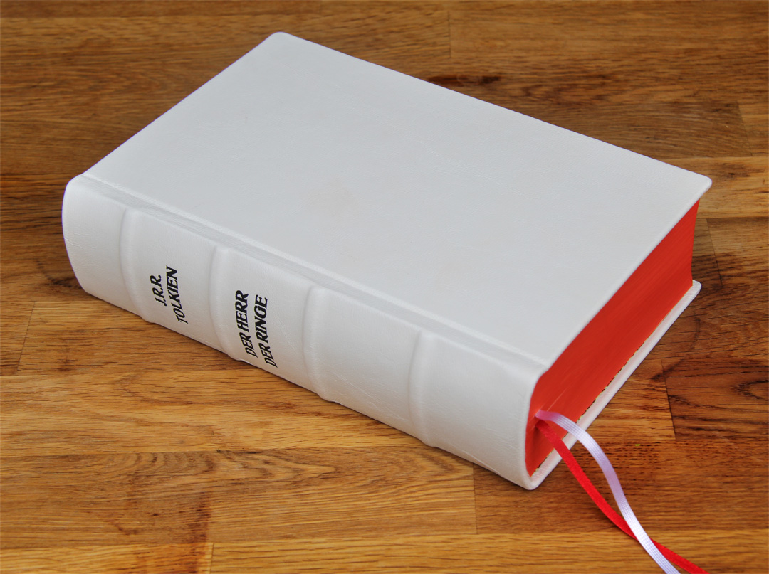
In the picture above, you can see the book without the slipcase. On closer inspection, you’ll notice that it’s not completely uniform — and when you hold it in your hands, you can tell it was made by hand. I love that unique charm: even though it’s obviously new and flawless, it still radiates something special.
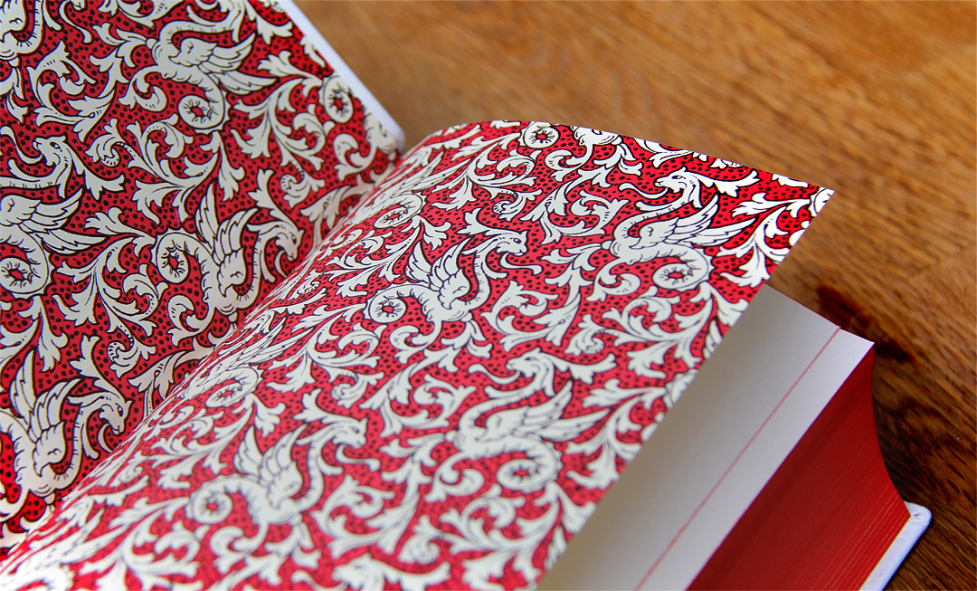
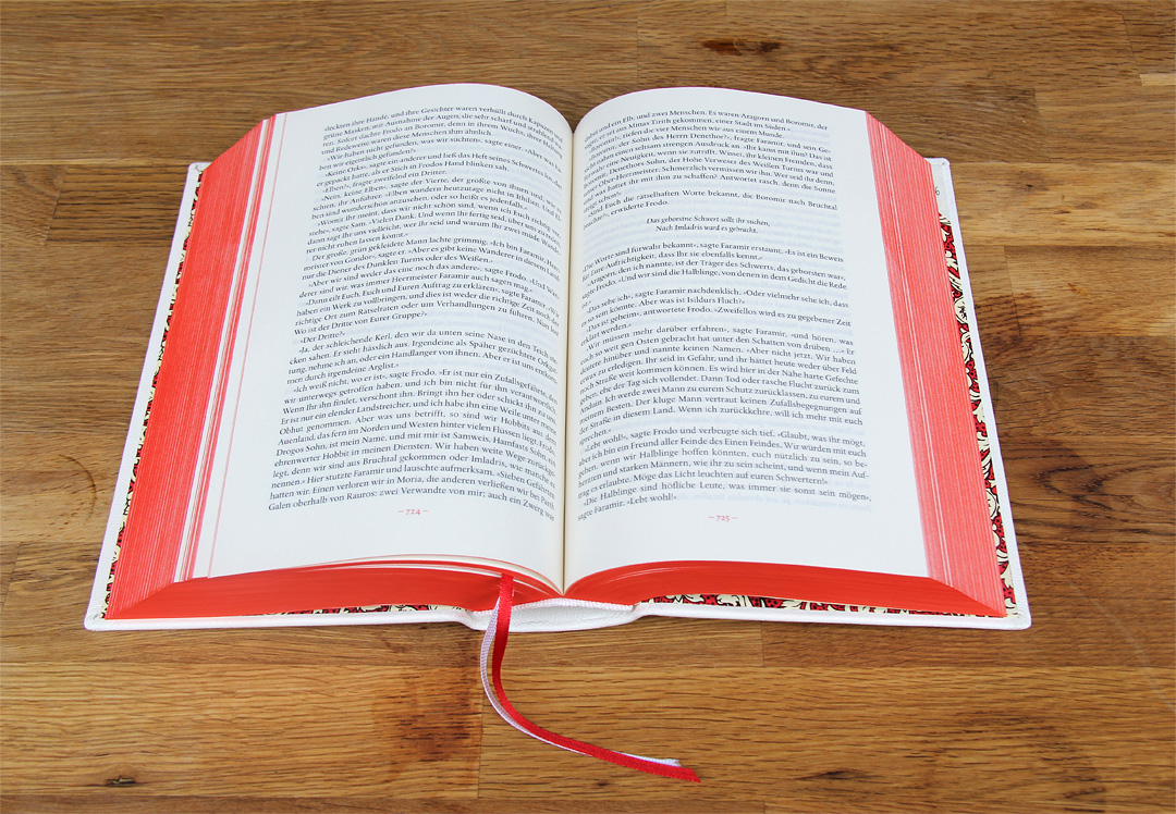
I chose red as the accent color. In Anna’s gallery, I discovered a lovely Polish edition featuring a stunning red endpaper with a dragon pattern. It looks elegant, high-quality, and very harmonious. Together with the red page edges and a red bookmark ribbon, the color scheme fits perfectly.
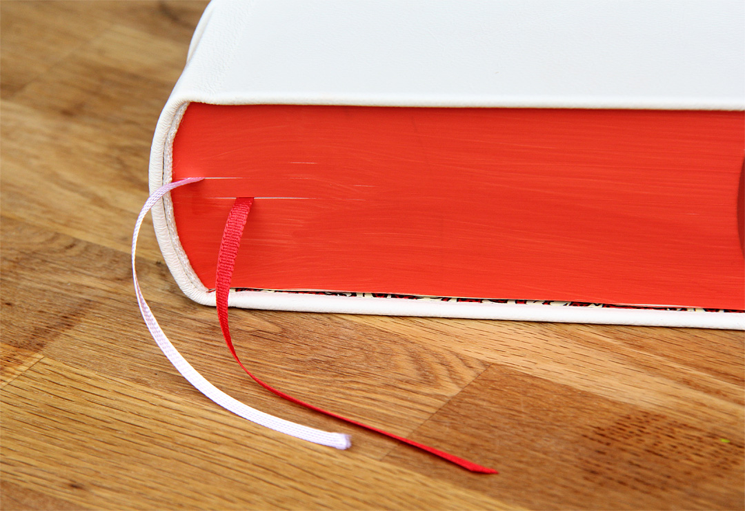
Originally, I had actually preferred blue as an accent color, but since I absolutely wanted the Carroux translation, it was clear that I’d go for the hardcover edition from Klett-Cotta. That one comes with red edges, so red and white became the two colors of choice. I’m not unhappy about it — the two colors complement each other beautifully, and the combination of red and white looks elegant and timeless.
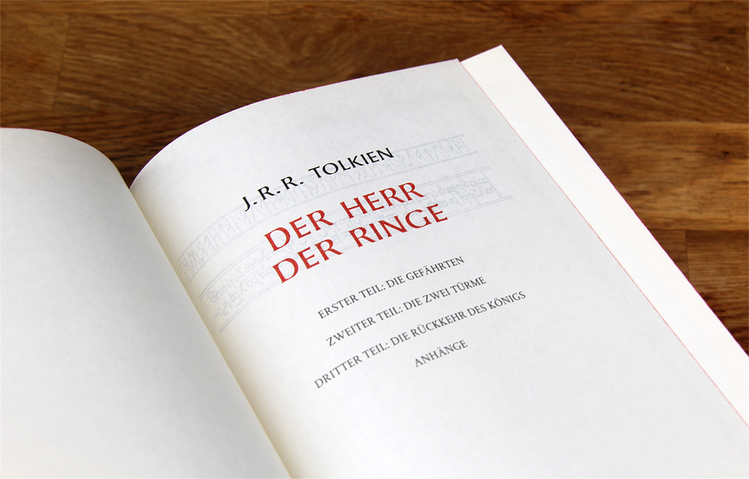
In terms of content, it’s the complete edition from Klett-Cotta, translated by Margaret Carroux. And since Klett-Cotta never skimps on quality, there’s nothing to complain about regarding the thin paper or the typography. It was also important to me to have all three books in one volume — I generally prefer complete editions. I find it practical to have everything in one book. With the beautiful War and Peace edition from Hanser Verlag, I’m slightly bothered that it’s split into two volumes. Though, to be fair, at a certain page count it becomes difficult to fit everything into one binding.
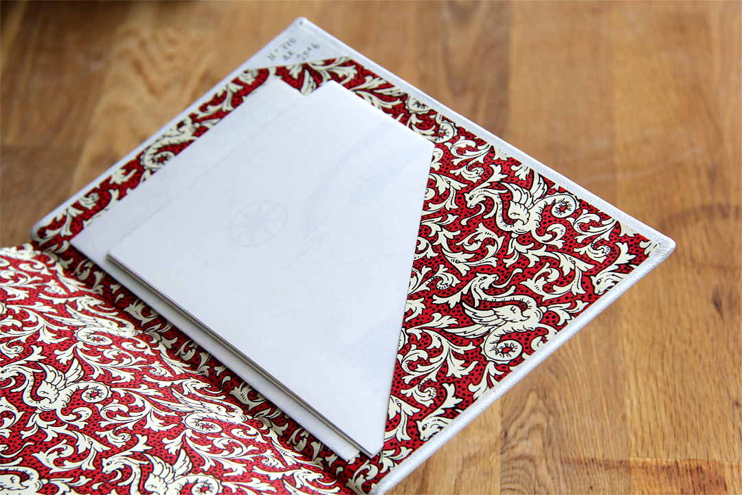
The Carroux edition includes two maps: one of The West of Middle-earth and one of Southern Rohan, Eastern Gondor, and Western Mordor. They are neatly stored in a pocket at the end of the book. Their somewhat simple design reflects their older origins. Yet, the sketch-like maps have a certain charm and evoke memories of my youth — a time when such additions still felt truly special.
Even with The Hobbit, a second bookmark ribbon wasn’t really necessary. In the Hanser editions, I always appreciate this feature since their extensive afterwords and numerous notes often invite you to flip back and forth while reading. The Lord of the Rings also comes with a detailed appendix. However, I’m not sure how often I’ll refer to it while reading. Still, it had to be two ribbons — simply for the visual appeal and because it might actually come in handy.
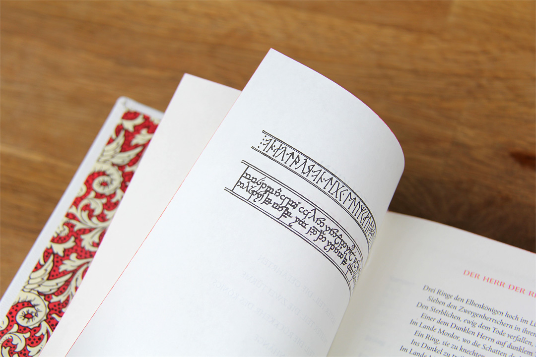
As you’ve probably noticed, this post is very photo-heavy, and of course, I don’t want to miss the chance to share some impressions of this beautiful piece and my excitement about it. The entire edition turned out wonderfully. Anna’s bookbinding artistry is superb, and the interior design — the typography, the runes at the beginning — sets just the right tone for a truly magical fantasy story.
The only downside is the sheer size of the book. Since I’ll mainly be reading this edition on the train, I’ll have quite a bit to carry around for a while. But I’m already well-trained — I’ve read Horcynus Orca and S. on public transport before, and in the end, it worked out quite well since I usually manage to sit or lean somewhere.
If I’ve now inspired you to get such a beautiful book, I can only recommend taking a look at Anna’s website or her eBay page. Browsing alone is already a pleasure. You can also get a sense of the prices there — some examples are listed on her site. Of course, this kind of luxury doesn’t come cheap, but it’s far more affordable than the Klett-Cotta deluxe edition. The price-performance ratio is absolutely fair, though it’s clear that such books mainly appeal to lovers of fine editions — and that’s precisely the kind of reader I am. So I’ll enjoy this treasure for a long time to come. I often walk past my bookshelf, pick up one of these beautiful volumes, and flip through it to relive those wonderful reading hours.
Danke für diesen großartigen Geheimtipp! Ich bin gerade sprachlos vor Begeisterung. Dass es Buchbinder wie Anna gibt, die Unikate ganz nach dem Wunsch des jeweiligen Lesers anfertigen, habe ich noch nie gesehen/ gehört. Annas Seite wird definitiv besucht und in ein paar Monaten werde ich mir sicher auch eines ihrer Prachtexemplare gönnen. Vielleicht komme ich so an meine lang ersehnte Schmuckausgabe von “Krieg und Frieden”…
Liebe Kathrin,
cool, dass dich das Buch auch so begeistert. Also dein Bücherregal Zuhause würde ich auch mal gerne durchstöbern. Wir haben einen echt ähnlichen Geschmack, das merk ich immer wieder. Darüber, Krieg und Frieden als schickes Buch bei Anna binden zu lassen, habe ich auch schon nachgedacht. Aber die Hanser Bücher sind eigentlich schon auf einem ziemlich hochwertigen Niveau, da kann ich nicht groß meckern. Wenn du so ein Buch fertigen lässt, dann musst du mir das unbedingt zeigen. Vielleicht spring ich dann auch auf den Zug auf ;)
Liebe Grüße
Tobi
Das stimmt, die Ausgaben des Hanser Verlags sind wirklich schon sehr hochwertig. Ich mag diesen Stil, der schlicht ist, aber trotzdem sofort erkennen lässt, dass es sich um Hanser-Bücher handelt.
Momentan gehen meine Überlegung dahin, dass ich mir dir Urfassung als Unikat anfertigen lasse – die gibt es nicht vom Hanser Verlag und ich wollte sie ja sowieso noch lesen, nachdem du mich damals so neugierig darauf gemacht hast!
Liebe Kathrin,
die Urfassung ist schon ein klasse Buch. Was für eine Ausgabe würdest du da nehmen? Ich hab die Taschenbuchausgabe vom Fischer Verlag und die ist top, da gibt es nichts zu meckern. Wenn das schick aussieht, könnte ich auch noch einmal einknicken ;)
Liebe Grüße
Tobi
Hallo Tobi,
bei der Urfassung hat man ja leider kaum Auswahl. Ich mag die Fischer Klassik-Reihe aber sowieso sehr gerne und hatte vor ein paar Monaten schon überlegt, mir diese Ausgabe der Urfassung zu holen. Mich schreckt es allerdings immer ab, wenn ein Buch mit +1000 Seiten als Taschenbuch verkauft wird – so dicke Bücher finde ich in diesem Format wenig angenehm zu lesen, abgesehen davon, dass sie meist auch schnell ziemlich abgegriffen aussehen. Aber das scheint bei der Fischer Ausgabe wohl kein Problem zu sein, wenn du so zufrieden damit bist?! Dennoch ist mir ein Hardcover lieber und ich werde die Fischer-Ausgabe als Grundlage für das Unikat nehmen.
Wie lang hat es denn eigentlich bei dir gedauert, bis das Buch fertig war – also beginnend bei der Auftragserteilung bis zur Auslieferung?
Liebe Grüße und einen schönen Sonntag!
Kathrin
Liebe Kathrin
ups, ganz vergessen, ich wollte dir ja noch antworten. Also das Anfertigen von dem Buch ging recht fix. Die Abstimmung am Anfang war eigentlich eher das, was Zeit gekostet hat. Das Fertigen von dem Buch hat nur wenige Tage in Anspruch genommen und ging echt fix.
Ich bin echt gespannt, wie sich die Urfassung als Unikat macht! Hast du schon was in Auftrag gegeben?
Liebe Grüße
Tobi
Ich wusste tatsächlich auch nicht, dass man sich seine Bücher so individuell gestalten lassen kann. Wirklich eine tolle Idee!
Die Gesamtausgabe vom Klett-Cotta Verlag gefällt mir sehr gut und auf die hätte ich wohl auch eine Auge geworfen, wenn ich vorhätte, mir den Herrn der Ringe zuzulegen (dann allerdings wohl nicht als Unikat). Wobei ich die klassischen grünen Ausgaben auch irgendwie charmant finde. Die muten schon fast nostalgisch an.
Ich habe auch erst durch Annas Seite erfahren, dass es überhaupt die Möglichkeit gibt, so ein Buch individuell gestalten und binden zu lassen. Ich finde das klasse, wobei das natürlich preislich ein Vergnügen ist, das ich mir nicht all zu oft gönnen werde.
Die grünen Ausgaben von HdR finde ich echt übel. Irgendwie nostalgisch sind sie, da geb ich dir absolut recht. Die hab ich vor zwanzig Jahren schon in der Bücherei herumstehen sehen. Aber die gebundene Fassung vom Klett-Cotta Verlag ist schon ohne zusätzlichen Pimpen sehr passabel.
Liebe Grüße
Tobi
ui, das Buch sieht ja schön aus. Ich wusste gar nicht, dass sowas möglich ist. Auch wenn so eine persönliche Prunkausgabe für mich noch weit entfernt ist. Das Vorsatzpapier gefällt mir besonders gut, das weiße Leder des Buches dürfte aber sehr anfällig sein, oder? Ich würde mich gar nicht trauen, dass in meine Tasche zu stecken oder irgendwo hin mitzunehmen, aus Angst, dass das Leder dreckig wird.
Liebe Grüße,
Lena
Bevor ich Annas Seite entdeckt habe, hätte ich auch nicht gedacht, dass man so etwas machen lassen kann. Also ich glaub, dass sich Buchbinder da wesentlich besser vermarkten könnten, wenn sie ihre Webseiten aufrüsten würden. Genau so wie Anna das macht, mit vielen Beispielen und auch ein paar Beispielpreisen, dass man sich da ein grobes Bild machen kann.
Das Leder macht einen recht widerstandsfähigen Eindruck und ich glaub, das könnte man auch abwischen. Also empfindlich wirkt das Buch nicht. Aber ich hab einen sehr praktischen Rucksack, der auf der direkt am Rücken ein großes Fach für ein Notebook hat. Das ist sehr gut gepolstert, gegen Regen gut geschützt und leicht zugänglich. Da bleiben bei mir auch nach einigen S-Bahn-Fahrten die Bücher wie neu. Aber auch bei einem so tollen Buch ist es mir wichtig, dass ich es lese und damit mein Vergnügen habe. Sonst bringt das schönste Buch ja nichts ;)
Liebe Grüße
Tobi
Hallo Tobi
Nach deinem gelungen Beitrag über den Hobbit, habe ich mich gefragt, welches Buch du für Herr der Ringe lesen wirst? Ich muss sagen, dass du eine wirklich tolle Ausgabe hast. Auch die Idee, sich das Buch neu Binden zu lassen ist ziemlich gut.
Ich denke, dass ein oder andere Buch von mir könnte tatsächlich mal ein neues Kleid vertragen.
Danke für den erneut tollen Beitrag.
Viele Grüße Rudi
Hallo Rudi,
die Hobbit Ausgabe ist auch echt ein Schmuckstück. Und als ich gesehen habe, was die HdR Prunkausgaben vom Klett-Verlag kosten, war klar, dass da eine andere Lösung her muss ;)
Liebe Grüße
Tobi
Hey Tobi,
eigentlich hast du recht, dass man diese Bücher mal wieder lesen muss. Ich besitze schon die Gesamtausgabe. Allerdings weiß ich gerade nicht, von wem die herausgegeben wurde. Das ist ein ganz rotes Buch und hat auch zwei Lesebändchen.
Lg Mel
Hallo Tobi,
wow, das Buch ist echt superschön & weiß ist immer edel. Hab schon länger kein so schönes Buch gesehen! Vor allem gefällt mir dieses weiß-rote Drachenmuster, passt auch voll gut zu Tolkien. Einfach ein Traum! Wünsch dir viel Freude mit diesem Buch, ich würde es auch sehr oft in die Hand nehmen!! LG
Hallo Tobi,
hatte vor kurzem ja noch gesagt, dass diese Carroux-Ausgabe aufgrund des Umfangs ja eigentlich sehr unpraktisch zum Lesen ist. Aber so ist es dann doch eine geniale Ausgabe geworden. Eine ganz tolle Arbeit der Buchbinderin. Die Seite werde ich mir auf jeden Fall merken. Könnte mich immer noch ärgern, dass ich damals die ledergebundene Dünndruckausgabe (Preis damals ca. 89,00 EUR) nicht gekauf habe….
Liebe Grüße
Thomas
Lieber Thomas,
nachdem ich das Buch nun einige Zeit mit dabei hatte, muss ich sagen, dass es gar nicht so heftig war. Also so schwer ist das Teil dann auch nicht. Aber ich kann dir nur empfehlen, bei der illustrierten Ausgabe zuzuschlagen, die nun im Oktober erscheint und die Übersetzung von Carroux enthält (65 Euro Einführungspreis).
Liebe Grüße
Tobi
Sehr chic geworden! Mir geht es so wie vielen, ich hatte auch keine Ahnung, das es überhaupt möglich ist, sich ein eigenes Buch binden zu lassen.
Herr der Ringe ist bei mir auch die Prachtausgabe im Regal, allerdings habe ich da eine Originalversion stehen. ;)
Liebe Hermia,
hast du die original Prachtausgabe vom Klett-Cotta Verlag. Also die weiße? Die ist ja schon krass teuer. Mit meinem Unikat bin ich schon sehr glücklich. Bei so einem Buch macht es echt Sinn ein paar Euro mehr in die Hand zu nehmen.
Liebe Grüße
Tobi
Um Gottes Willen, so viel verdiene ich nicht. ;-)
Eigentlich habe ich drei Ausgaben, eine deutsche und zwei englische, ich habe die vor längerer Zeit mal in meinem Blog gezeigt, deshalb hier einfach der Link: https://phelmas.com/2013/05/16/vintage-books-2/
Mir treibts grade die Tränchen in die Augen. Richtiges Buchhandwerk, wo bekommt man das heute noch zu sehen? Vielen Dank für diesen Beitrag.
Meine HdR-Ausgaben sind aus den 70ern, die habe ich mal aus einem Bibliotheksfundus bekommen. Nicht schön anzusehen, und vollkommen zerrupft, aber ich gebe sie nicht her. Sie haben nun einmal eine Geschichte zu erzählen. Vor einigen Jahren ist dann zum tatsächlich lesen können zusätzlich die rote Gesamtfassung eingezogen, auch hier aber weiterhin Treue zur Carroux-Übersetzung. Der Hobbit ist unter Krege passabel und nun einmal vollständig, aber hier bevorzuge ich trotzdem die kindlichere Version von Scherf. So hat jeder seine Präferenzen.
Buchige Grüße
Christina (booksnstories)
Was für eine schöne Idee, Bücher individuell zu binden und zu gestalten! Da steckt wirklich viel Liebe drin :) Trotzdem würde auch ich niemals meine “Herr der Ringe”-Ausgabe weg geben. Irgendwann wachsen einem so Bücher doch ans Herz :)
Danke für die Bilder, die machen an. Der Preis eher nicht, ist wohl aber berechtigt. Als Geschenk?
Lieber Tobi,
ich habe gerade deinen Beitrag entdeckt und bin begeister, dass man sich seine liebsten Buchschätze so individuell und hochwertig gestaltet binden lassen kann. Danke für diesen tollen Tipp! Die Seite werde ich mir auf jeden Fall merken!
Viele Grüße
Bella